KPI-Tree & Performance Control
With a good reporting structure to more transparency & efficiency.
Services in the area of operational excellence
Services in the area of operational excellence
Simple key figure systems for the highest demands
Efficient performance management in a company requires more than just key figures and targets. It is crucial that the reports are easily accessible, that opposing effects become transparent and that the key figures are interpreted in the same way across the different levels and departments. Real-time reporting, which links directly to the existing ERP & MES system, helps here.
The KPI tree structures the KPI system and enables smart applications such as drill down dashboards. With the KPI driver tree we make it clear and understandable for all parties involved how the interdependencies of key performance indicators are and how the essential can be extracted from the unessential. We put the right focus on the profitable activities and improvements.

Bottom up Implementation
Implementation phases
Through the first implementation phase, the KPIs become available first in the direct areas – shop floor and logistics are the first to be motivated to outperform the status quo within the KPI project.
ifp USP
- KPI Tree
- BI Expertise
- Know how of connection and implementation
- Cooperative approach / development of the target picture in coordination with the operating units
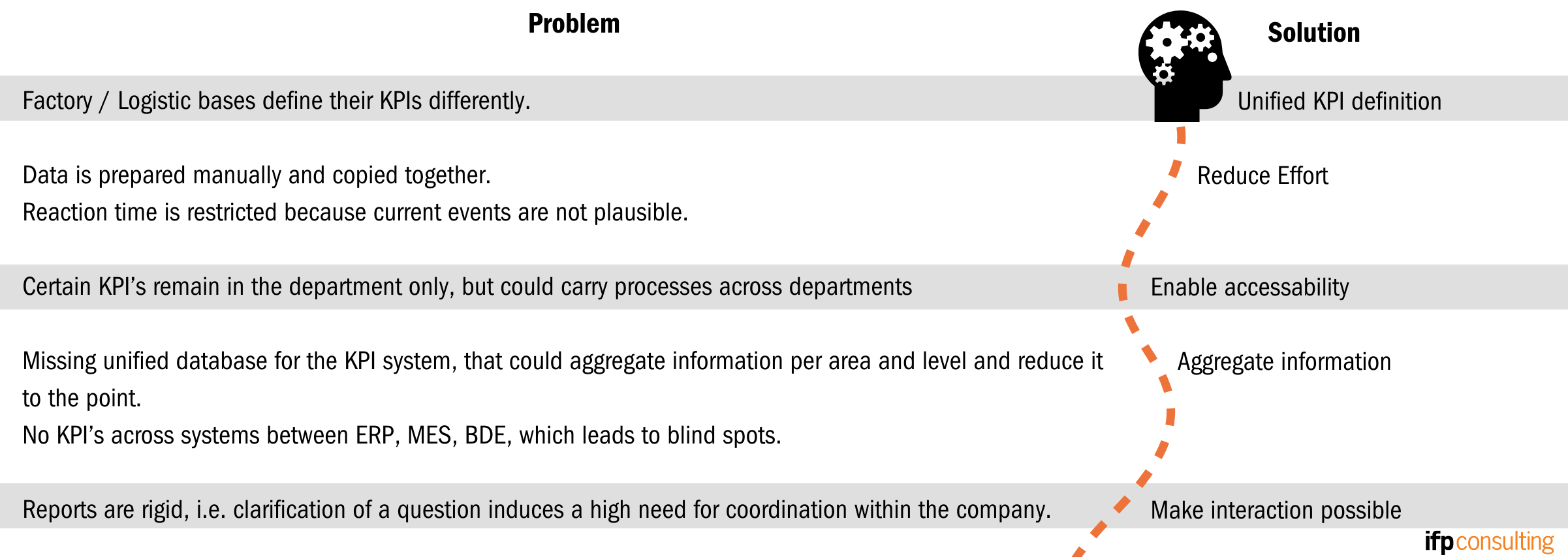
Typical Reporting Problem Areas and Goals of Smart Reporting
Get to the root of the problem with interactive dashboards
By connecting the BI tool that is right for you to the ERP, MES or BDE systems, you will benefit in the long term. Having a dashboard where the context is live and clearly summarized is one side. On the other hand, a well thought-through dashboard design is crucial. Because this is where reporting becomes a tangible tool for cause research and control!
If individual reports are built on top of each other, a top-level effect can be tracked in the layers below and the origin or composition of the effect can be better understood. For example, productivity in a plant may have dropped. For internal processes, an SPQL dashboard here summarizes the essential aggregated data on safety, productivity, quality and supply chain. Browser-based dashboards from established BI software make it easy to disseminate and access information. In addition, traceability is promoted and targeted follow-up control is made possible.
We mirror the processes in charts and graphs
Through extensive implementations, we have the experience to work with your departments as a team to ensure optimal, user-friendly reporting. We also bring a high level of technical understanding in the area of production and logistics via the connection of BI software.
We pay special attention to department-typical problem interfaces, such as sales volume vs. production capacity (S&OP dashboards), as this is often where great potential arises in the context of objectifying the discussion. Our methodology for building the KPI Tree ensures interactive reporting, enabling more responsive and efficient action from management to workers & logisticians.

We support you in setting up a comprehensive live analysis
- Review
Analysis & optimization of your BI solution - BI Tools
Selection and implementation of software suitable for your company - Building KPI Trees
The right information in the right place from the shop floor to management - Drill-down Dashboards
Get to the heart of the deviation with live interactive dashboards - Key figure development
Systematic derivation of specific key figures - Trainings
Development of internal know-how through key user training
Track root causes with interactive dashboards
We assume that a drop in productivity has been identified in the SPQL dashboard below. For 2 scenarios, an example is given of how a source of error can be identified. Buttons and interactive diagrams are available for exploration – data basis are mainly ERP, MES & BDE systems – if necessary also monthly files from training systems, separate personnel systems, etc. stored on a server.
Scenario A – Raw material quality defects
In addition to the drop in productivity, we see directly in the SPQL dashboard that there were an unusually high number of Q messages at the same time. By clicking on the Q-messages, a new view opens and we see that a large part of the Q-message “Raw material defective” has been posted. Through the interactive dashboard, we can drill down one level. Here, for example are the materials and work centers responsible for Q-messages displayed in descending order of frequency – if the productivity analysis is performed with a filter on the work centers the same productivity as in the previous month has been achieved. The correlation is therefore clear. If necessary, measures must be taken with regard to the quality of the suppliers.
Scenario B – Overloaded workplace
In the SPQL dashboard, there are no explanations other than the productivity drop. We go into the productivity analysis at the job level and see some unproductive jobs. When switching the view to the backlog, a workstation is heavily overloaded. If we click on this, the job analysis shows us that the following jobs are the unproductive jobs. Now we know, for one thing, where short-term countermeasures need to attack – at the bottleneck. In contrast to scenario A, the disposition or a disorder seems to be the background here. With another dashboard showing the state distribution of jobs, we can disprove the thesis of disruption. Scenario B is therefore a special dispositive situation because of the short-term productivity slump.

Do you have any questions?
We are happy to help!
Your contact: Dr. Gerhard Nowak


